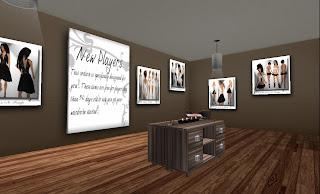
This store has a lot of space for people to walk around I like the light color scheme. Nothing competes with the pictures of the clothes on the walls. Some of the pictures are just art - see the big scrolls in the 2nd picture..There are some big pictures with ideas of how to wear the clothes as outfits as shown in the 2nd picture
This store uses the pictures of the products approach to displaying items for sale. But they are spaced out around the room, color choices are shown in the dots on the side
I am not sure of the purpose of the little space..The store has apple in its name which explains the giant apple here and elsewhere in the store..just not sure why a little space surrounded by curtains. It did break up the floor space, added a little touch of color to the floor.
An interesting marketing idea - a room with stuff for new users..I think these things were free for people whose avies were less than 30 days old..It's a way to get a player hooked on your brand from the beginning, get traffic into your store, get your goods out there for others to see. This room was not easy to find up on the 2nd floor, kind of back in a corner..so they have to "work" for their freebies
Here's some pics from another big store (i have got to remember to write down SLURLS for the stores)
More light colors.
THis store has floors, small nooks, departments..content spread out across the big space with some organization to help the user find what they want
Here's a big open space..with seating in the center of the space...Something important is going on with seating..most of the stores have it. I've only ever used ti to sit and wait while things rez around me. But real life stores have seating because people need to rest their feet or husbands need to wait for wifes...Why is there seating in SL?


No comments:
Post a Comment