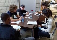
This blog serves as a place to talk about my experiences playing new-to-me videogames and hanging out in SecondLife. It might encourage others to try playing games and spending time in virtual worlds.
Friday, January 16, 2009
Tuesday, January 13, 2009
A post about style, look and feel
I read in the text book for next semester about levels in games and it mentioned that US games tended to be conservative with styles and Japanese games more adventurous. Here are some images nad videos from teh games the book mentioned that seem to be worth looking at. I think we could find some US games - i wonder if next gen consoles might have the computational horsepower to do cooler graphics, more realism, hyper realism
Vib Ribbon

Official VibRibbon homepage
Youtube video demonstration
Vib Ribbon

Official VibRibbon homepage
Youtube video demonstration
Rez
Wiki page
Space Channel 5 (for the dreamcast
Wiki pge for the game
YouTube video
I may have a game buying addiction
I Image by kgregson via Flickr bought some more game for the game design program - mostly card games because they have some interesting gameplay mechanics and rules. And remember I've said you can make a game about anything - check out these topics - zombies, sushi, sammich making, bean farming, school politics, medieval politics.... And I bought most of them locally (in Binghamton) at Jupiter Games. Here's a link to their website and to a yelp page with a map. The store has game nights on Friday that would be worth going to. They regularly attract about 30 players. They have a big collection of games open to play. And people seemed open to teaching games to newbies (for folks from Intro to Games & Society - they have Race to the Galaxy and know how to play it! And like playing it!!!)
 Image from Coloretto via WikipediaHere's what I bought over break.
 Image via Wikipedia
 Image by kgregson via Flickr bought some more game for the game design program - mostly card games because they have some interesting gameplay mechanics and rules. And remember I've said you can make a game about anything - check out these topics - zombies, sushi, sammich making, bean farming, school politics, medieval politics.... And I bought most of them locally (in Binghamton) at Jupiter Games. Here's a link to their website and to a yelp page with a map. The store has game nights on Friday that would be worth going to. They regularly attract about 30 players. They have a big collection of games open to play. And people seemed open to teaching games to newbies (for folks from Intro to Games & Society - they have Race to the Galaxy and know how to play it! And like playing it!!!)
 Image from Coloretto via WikipediaHere's what I bought over break.
- Wasabi (card game - make sushi by Joshua Cappel and Adam Gertzbein)
- Bohnanza (card game about bean farming by Uwe Rosenberg)
- Coloretto (card game by Michael Schacht)
- Ticket to Ride (dice expansion)
- Citadels (card game about medieval cities, nobles and intrigue - by Bruno Faidutti)
- Grave Robbers from Outer Space (card game based on b-movies)
- Lunch Money (card game - girl grade school students beat each other up for ...)
- No Thanks (card game where you want to get the lowest number of points - by Thorsten Gimmler)
- Zap Bam Pow (card game)
- Road Race (dice game (we may just use the dice in other games but we'll try this one first)
- Phase 10 (card game)
- Frog Juice (card game about spells and concotions)
- Slamwich (card game)
- Monkeyes on the moon (card game, strategy about developing the monkey civilization by Jim Doherty)
- MMMM...Brains (dice game by Reiner Knizia)
- Pink Godzilla Dev Kit (cards
 Image via Wikipedia
game interface ideas from other fields
Check out this dashboard from a Ford car (the Fusion I think) introduced at the 2009 Detroit Car Show - here's a link to the post.

Like a videogame, the info needs to be scanned often and quickly, and understanding it can't distract too much from the other tasks underway (shooting monsters and cruising along at 75 mph (don't tell my mom I speed, ok?). This dashboard has taken those needs into account with visuals such as bar graphs for gas and power steering fluid levels, for average MPG. And check out those vines; they live or die based on how fuel-efficiently you drive.
Check out the link in the article cited above for the Lamborgini dashboard - wtf?

Once you learn what all the dials and needles do (read the manual? - I don't see much text on the dashboard itself), is this a better idea for a videogame interface?
Here are some pictures of other dashboards for comparison.
 Image via Wikipedia
 Image via Wikipedia
We need to look for interface ideas in lots of other info-rich places - maybe those car GPS systems, or even things like complicated phone bills or monthly statements from people with actively traded brokerage accounts or mutual statement quarterly statements.

Like a videogame, the info needs to be scanned often and quickly, and understanding it can't distract too much from the other tasks underway (shooting monsters and cruising along at 75 mph (don't tell my mom I speed, ok?). This dashboard has taken those needs into account with visuals such as bar graphs for gas and power steering fluid levels, for average MPG. And check out those vines; they live or die based on how fuel-efficiently you drive.
Check out the link in the article cited above for the Lamborgini dashboard - wtf?

Once you learn what all the dials and needles do (read the manual? - I don't see much text on the dashboard itself), is this a better idea for a videogame interface?
Here are some pictures of other dashboards for comparison.
 Image via Wikipedia
 Image via Wikipedia
We need to look for interface ideas in lots of other info-rich places - maybe those car GPS systems, or even things like complicated phone bills or monthly statements from people with actively traded brokerage accounts or mutual statement quarterly statements.
Subscribe to:
Comments (Atom)
![Reblog this post [with Zemanta]](http://img.zemanta.com/reblog_e.png?x-id=94406e30-7018-480e-8d80-3b71cf853ff0)
![Reblog this post [with Zemanta]](http://img.zemanta.com/reblog_e.png?x-id=35dae49d-c686-4642-bfa4-a19fd35cf03d)
![Reblog this post [with Zemanta]](http://img.zemanta.com/reblog_e.png?x-id=f4595a9d-3726-42cb-9751-d7cc8ea7895f)
![Reblog this post [with Zemanta]](http://img.zemanta.com/reblog_e.png?x-id=e435fc3d-88d6-4602-b4bc-929f4518ec3b)